My Role
Brand Identity
Visual Identity
Product Design
Print Design
Tools
Illustrator
Indesign
Photoshop
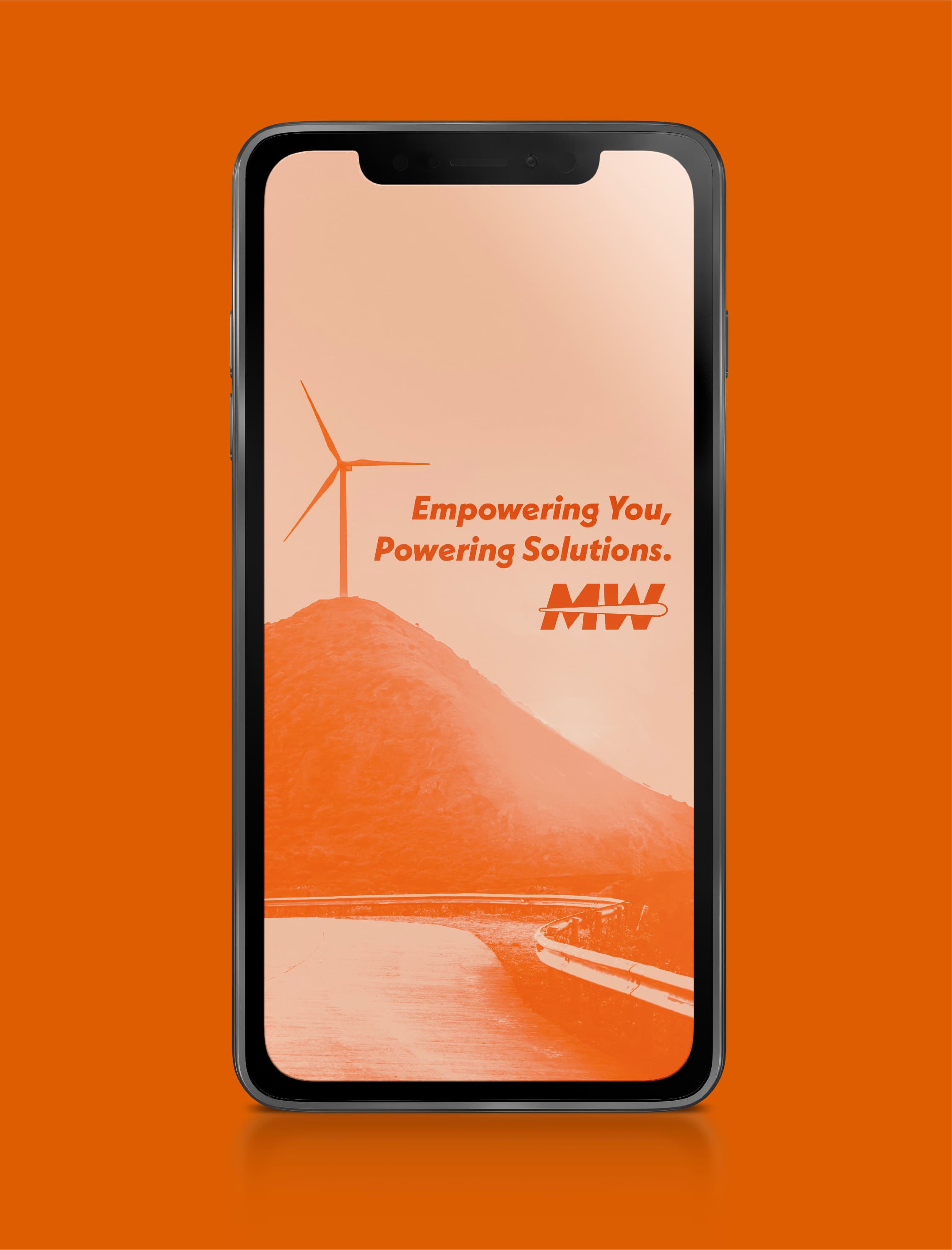
Midwind Solutions is a multifaceted business with a primary focus on replacing coolant in wind turbines, with future plans to expand into other areas of servicing and maintenance within the turbine industry. What sets this company apart from many wind energy businesses is its dedication to creating opportunities for young and aspiring entrepreneurs from diverse backgrounds this commitment to inclusivity is a rarity in the industry. Their guiding motto, 'Empowering You, Powering Solutions,' underlines their mission and values.

Nostalgia is a core value at PLENTY, ensuring that guests from all different generations find something that touches their hearts. The flagship location can be found in the Historic Automobile Alley, occupying the original Chevrolet Dealership in OKC. By combining these two significant aspects of the business, I sought inspiration specifically from old tin packaging, such as oil cans and vintage candy.
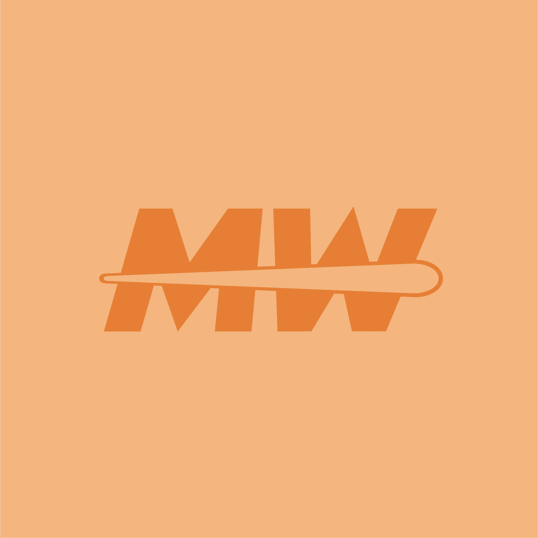
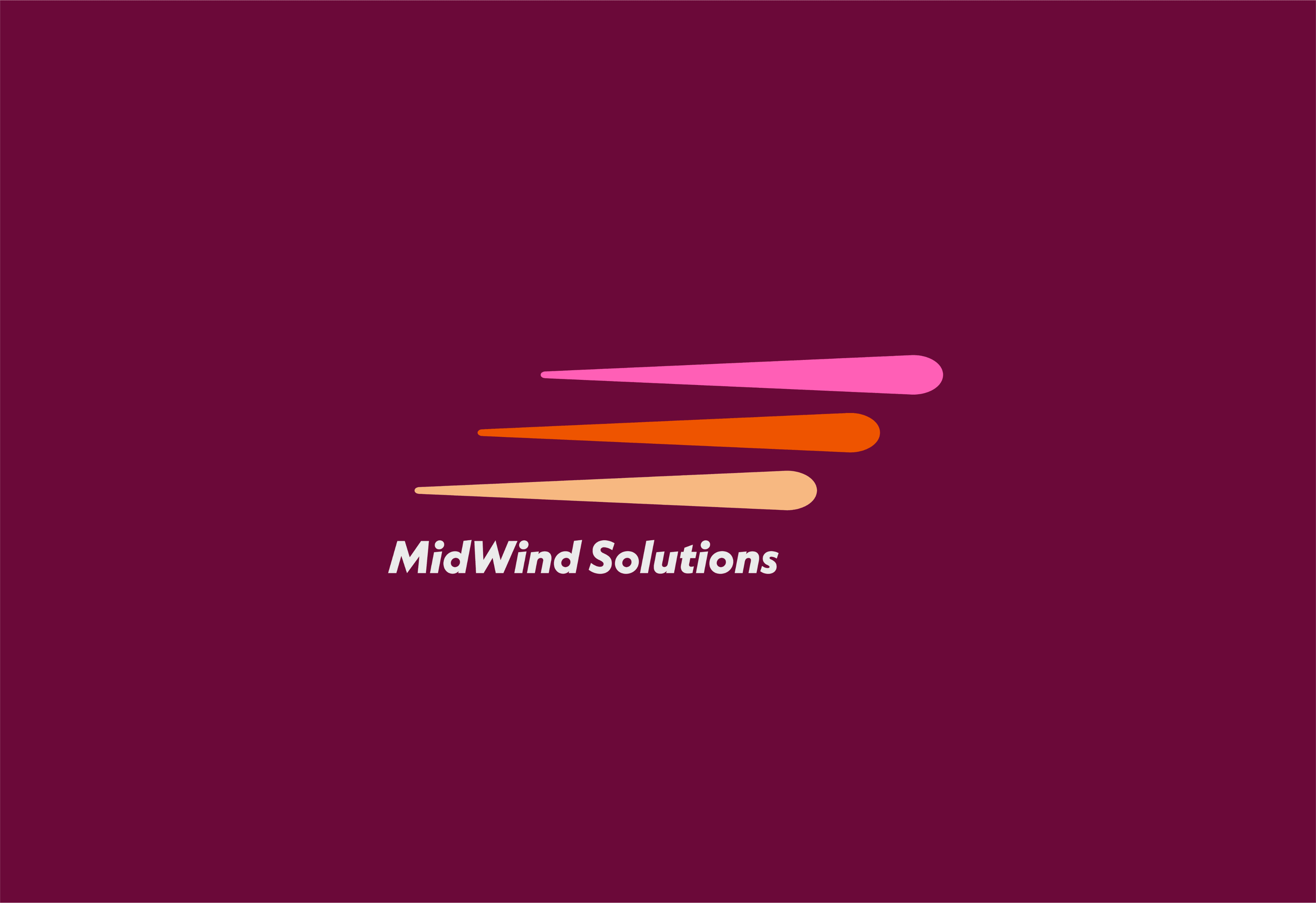
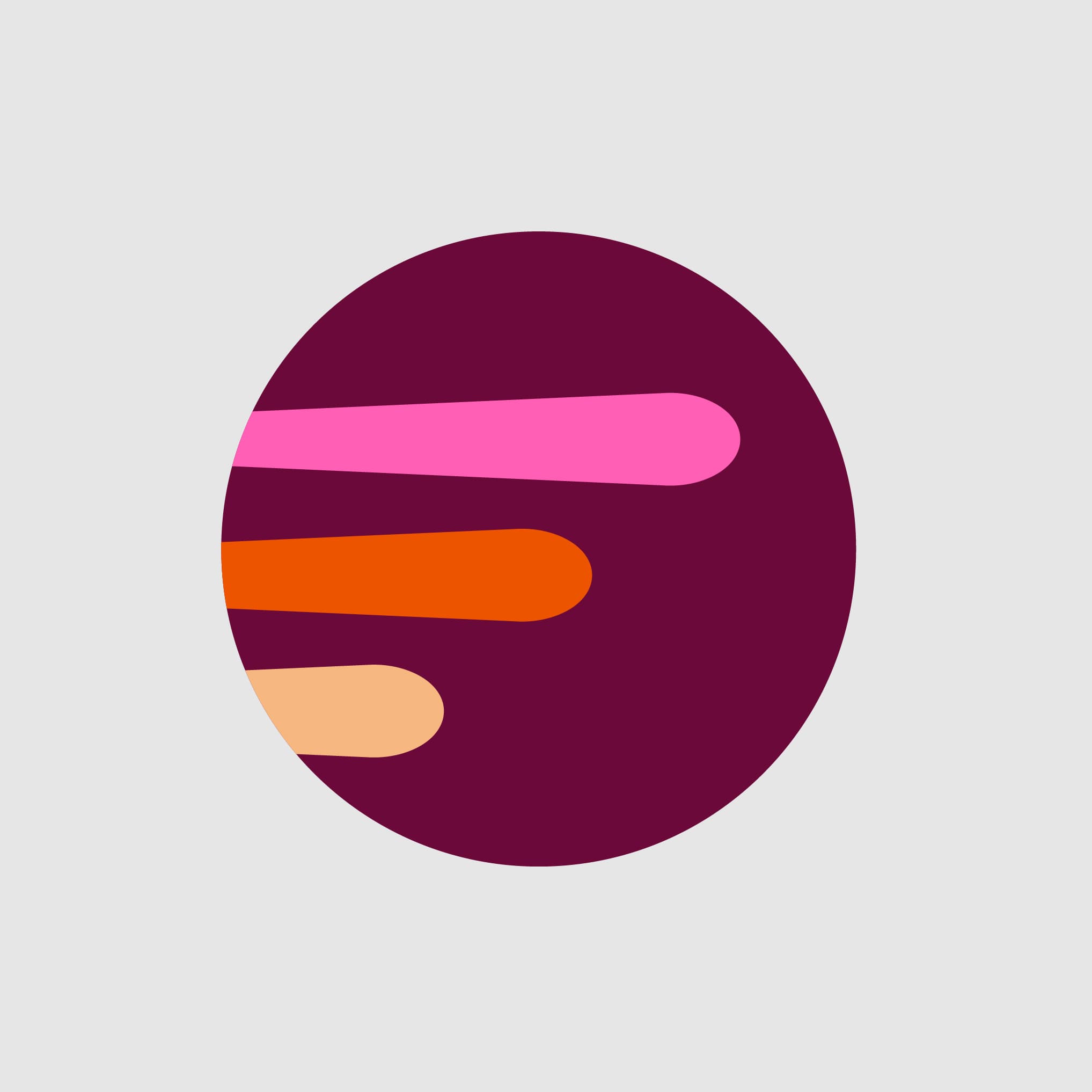
When designing the logo, the client wanted versatility while retaining brand recognition. Preserving the wind turbine’s essence was key. I deconstructed and stacked turbine blades for a dynamic mark, emphasizing movement with an italicized typeface. Turbine details were also integrated into each mark. I also made a standalone logo with playful brand colors for adaptability.
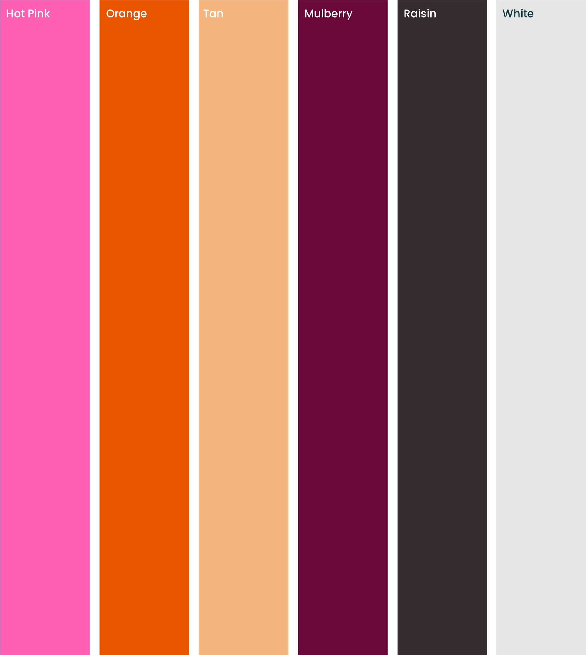
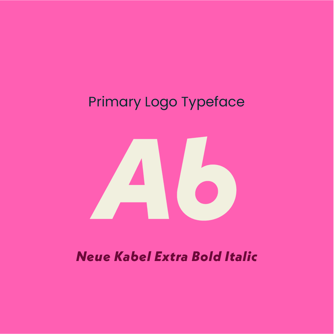
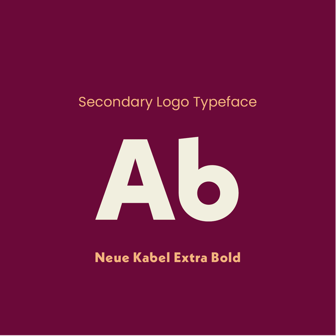
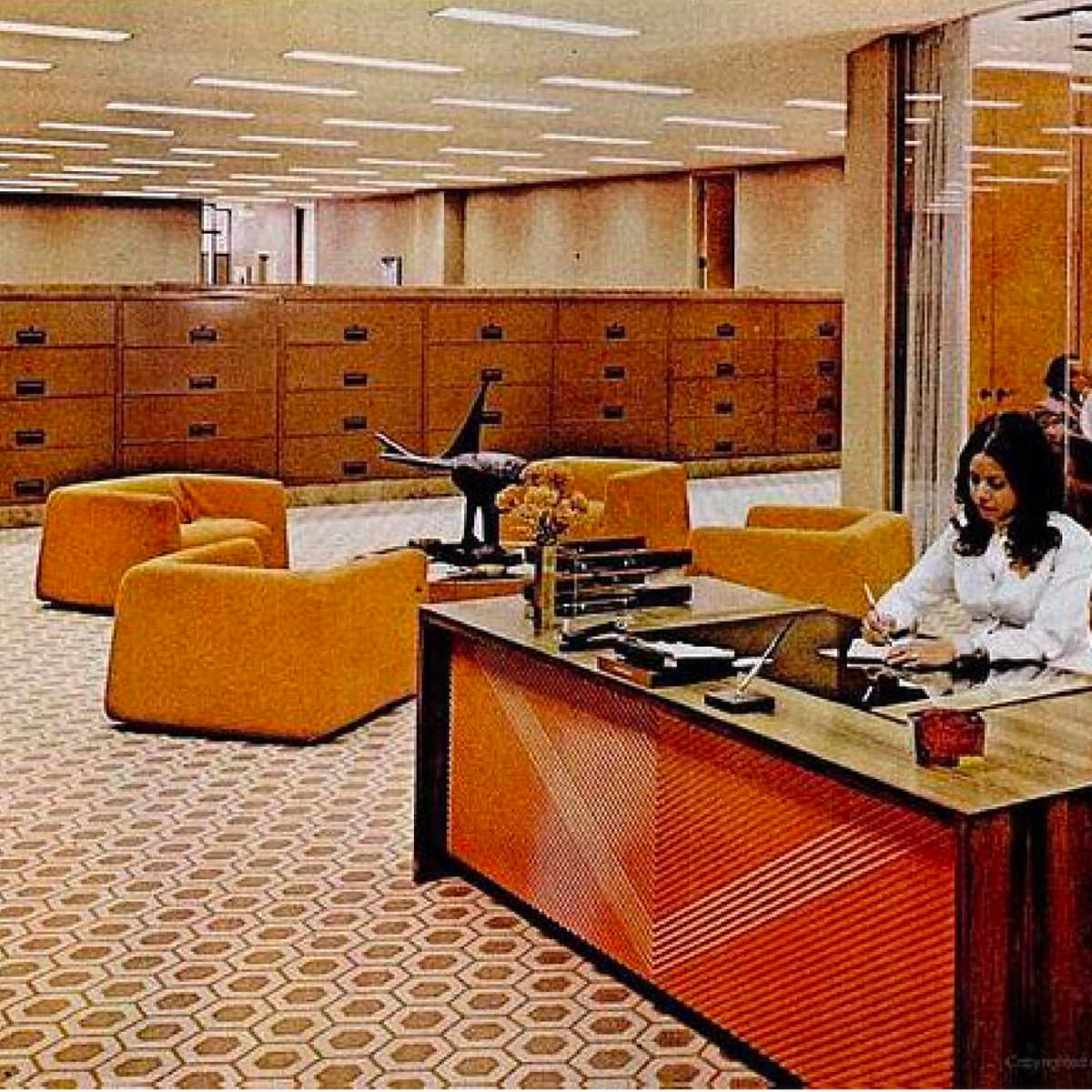
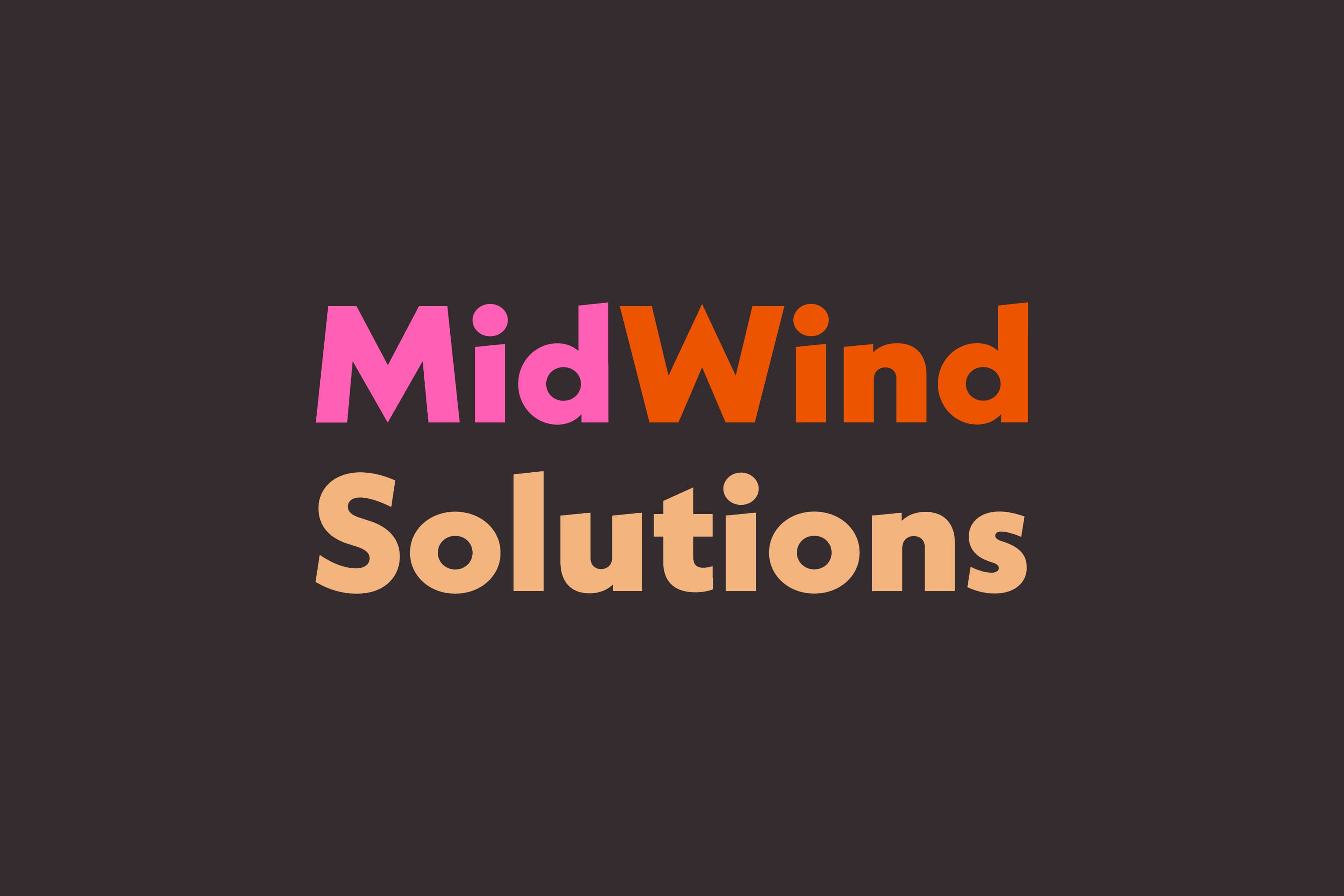
Incorporating funky pink into MidWind’s brand colors was a firm requirement. This vibrant pink, combined with other vintage hues, establishes the ideal 70s throwback ambiance. While Neue Kabel is originally a typeface designed in the 20s, it gained immense popularity during the 70s, particularly in its extra bold and black weights. Selecting this typeface for the logo was an obvious choice to enhance the retro aesthetic.
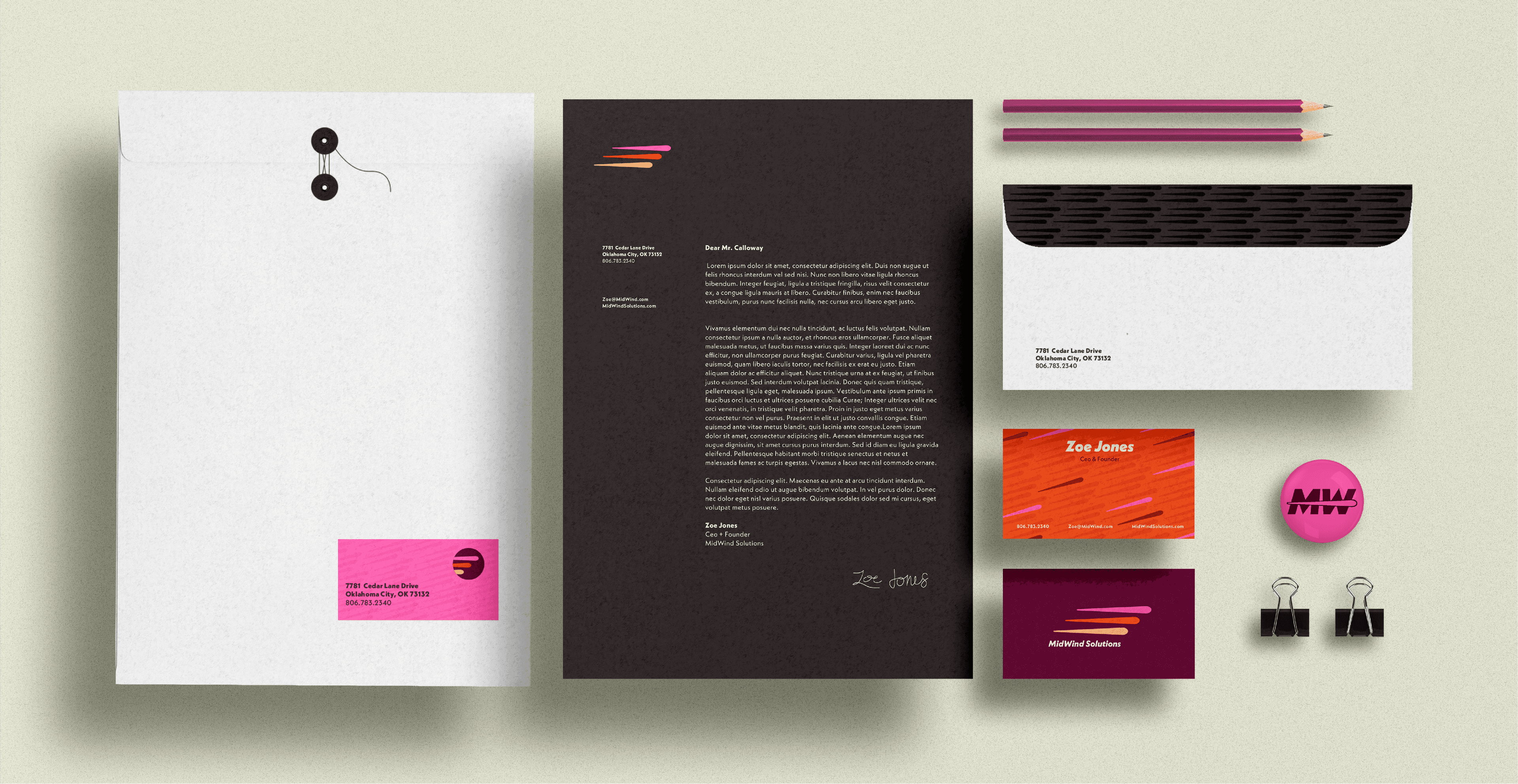


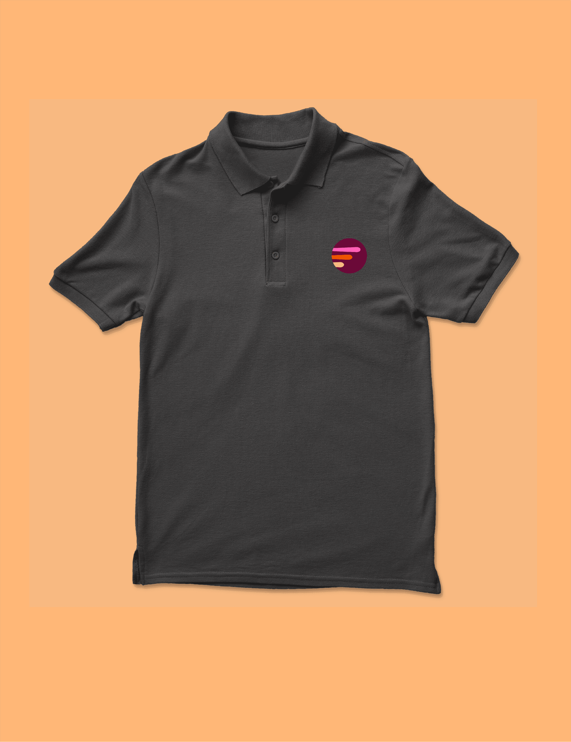
At the outset of this company’s journey, the utmost priority lay in establishing its brand identity. Nevertheless, the client also expressed a strong desire for key brand collateral, including business cards, branded apparel, and a letterhead. By harnessing each brand color, I ensured a seamless extension of the brand across these materials, with a focus on using the logo elements and the company motto, ‘Empowering You, Powering Solutions.’ The overall result evokes nostalgia without feeling outdated, and maintains a warm and welcoming atmosphere.