My Role
Brand Identity
Visual Identity
UX/UI Design
Product Design
Package Design
Advertising
Tools
Figma
Illustrator
Photoshop
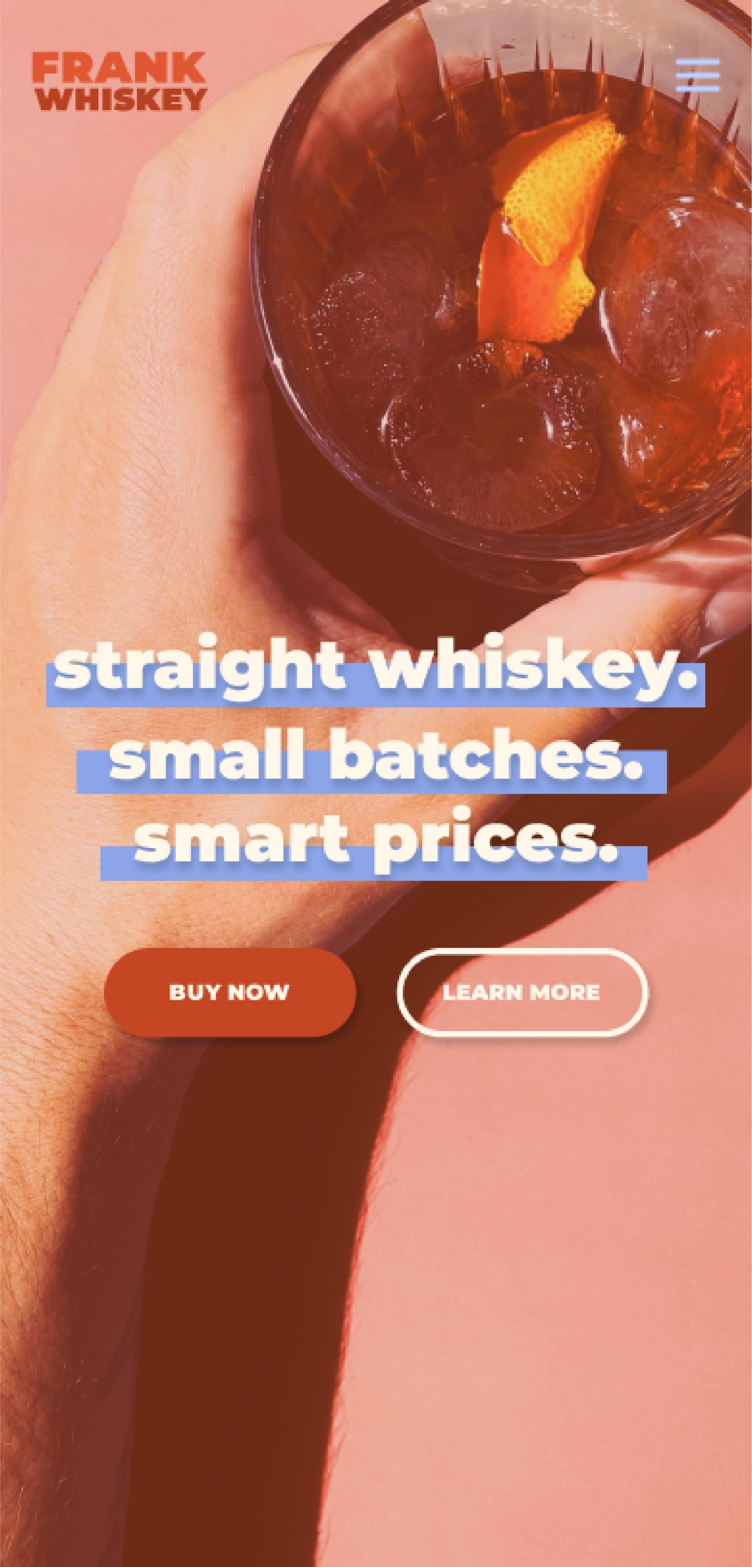
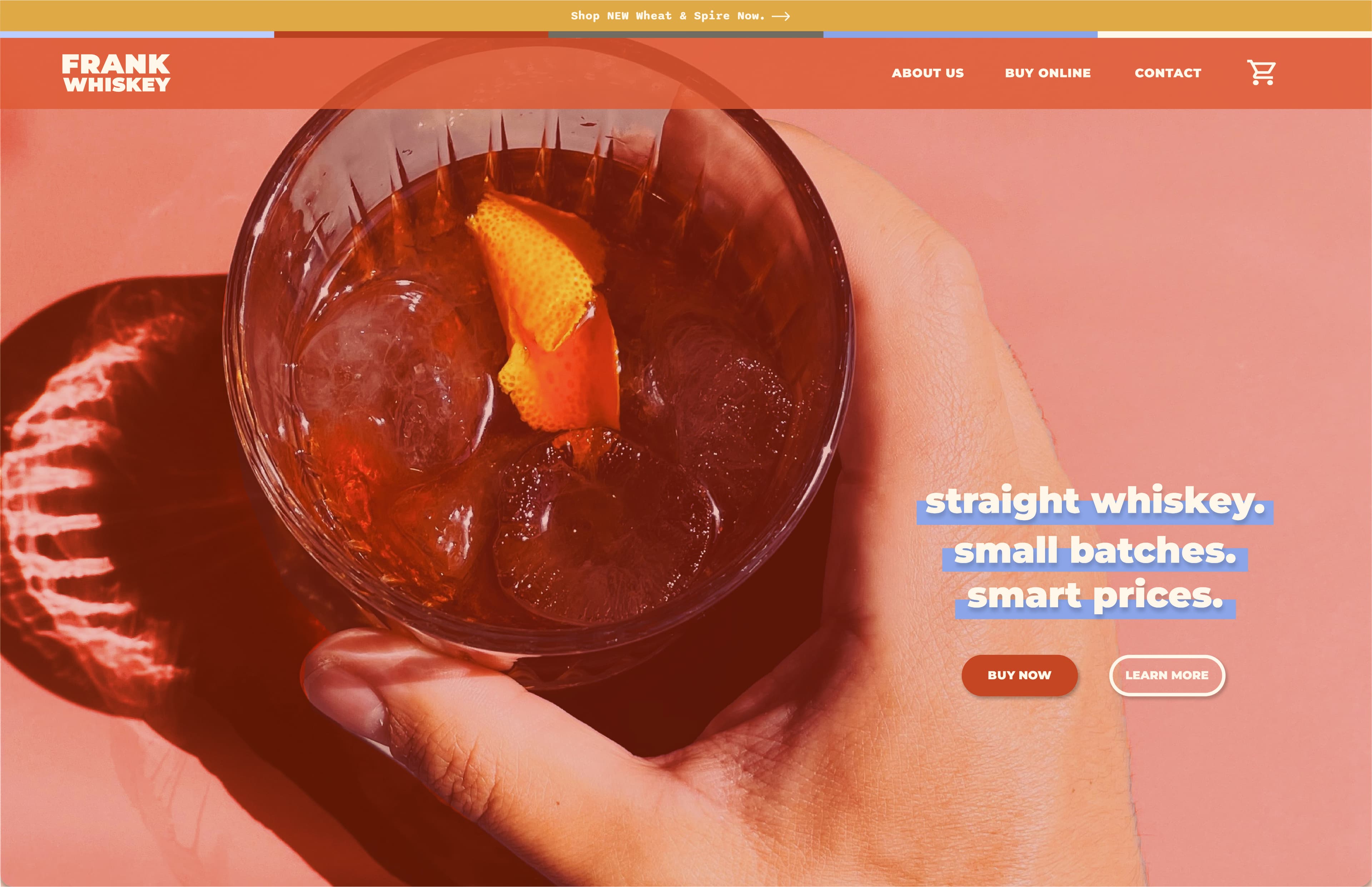
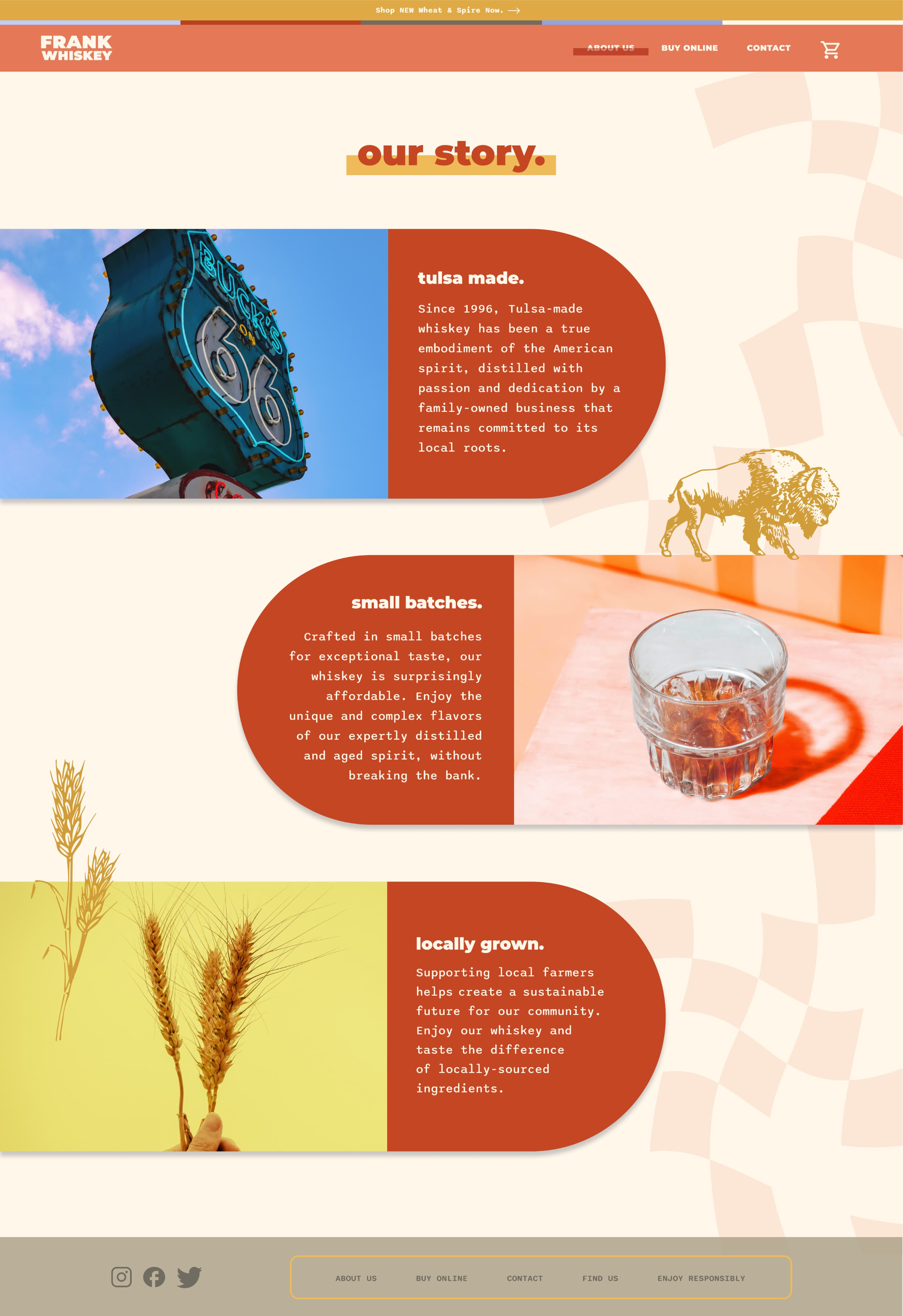
Frank Whiskey, a conceptual project developed through a Figma course, was born from the unexpected blend of my pug 'Frank' and the city of Tulsa, Oklahoma. Guided by a target consumer named 'Matt,' a single mid-30s dad in search of an affordable yet enjoyable whiskey, we created Frank Whiskey—a straight, small-batch whiskey at smart prices. It's the perfect choice for easy sipping without breaking the bank.
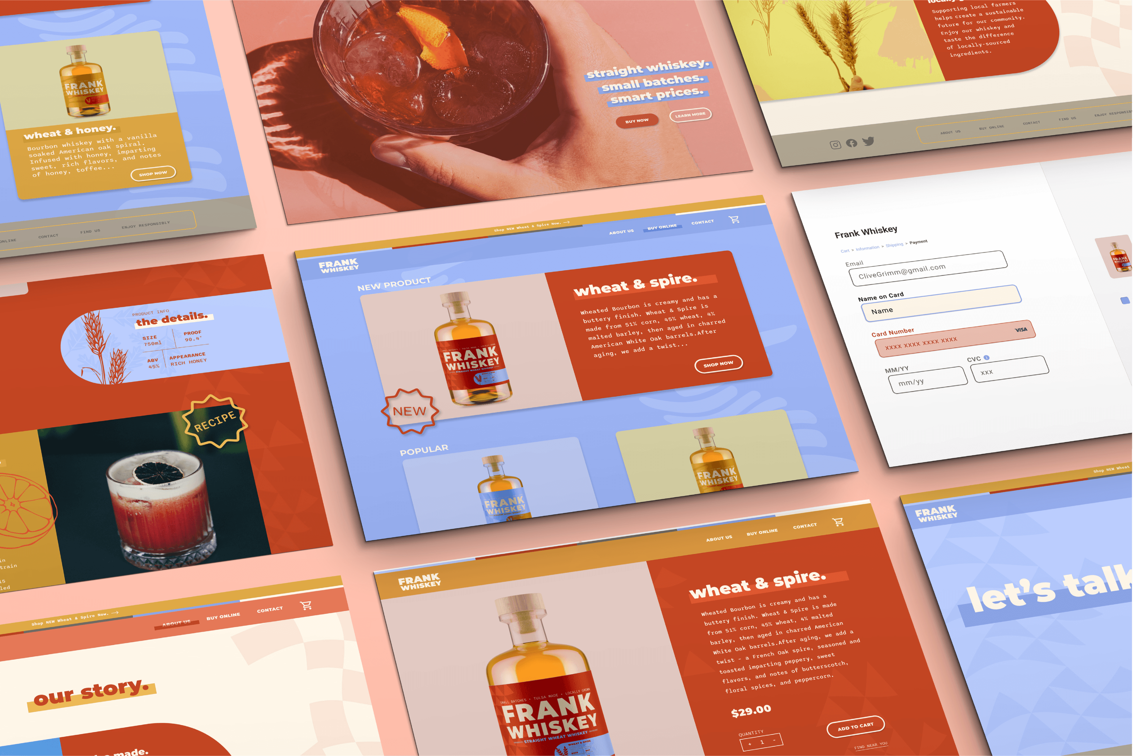
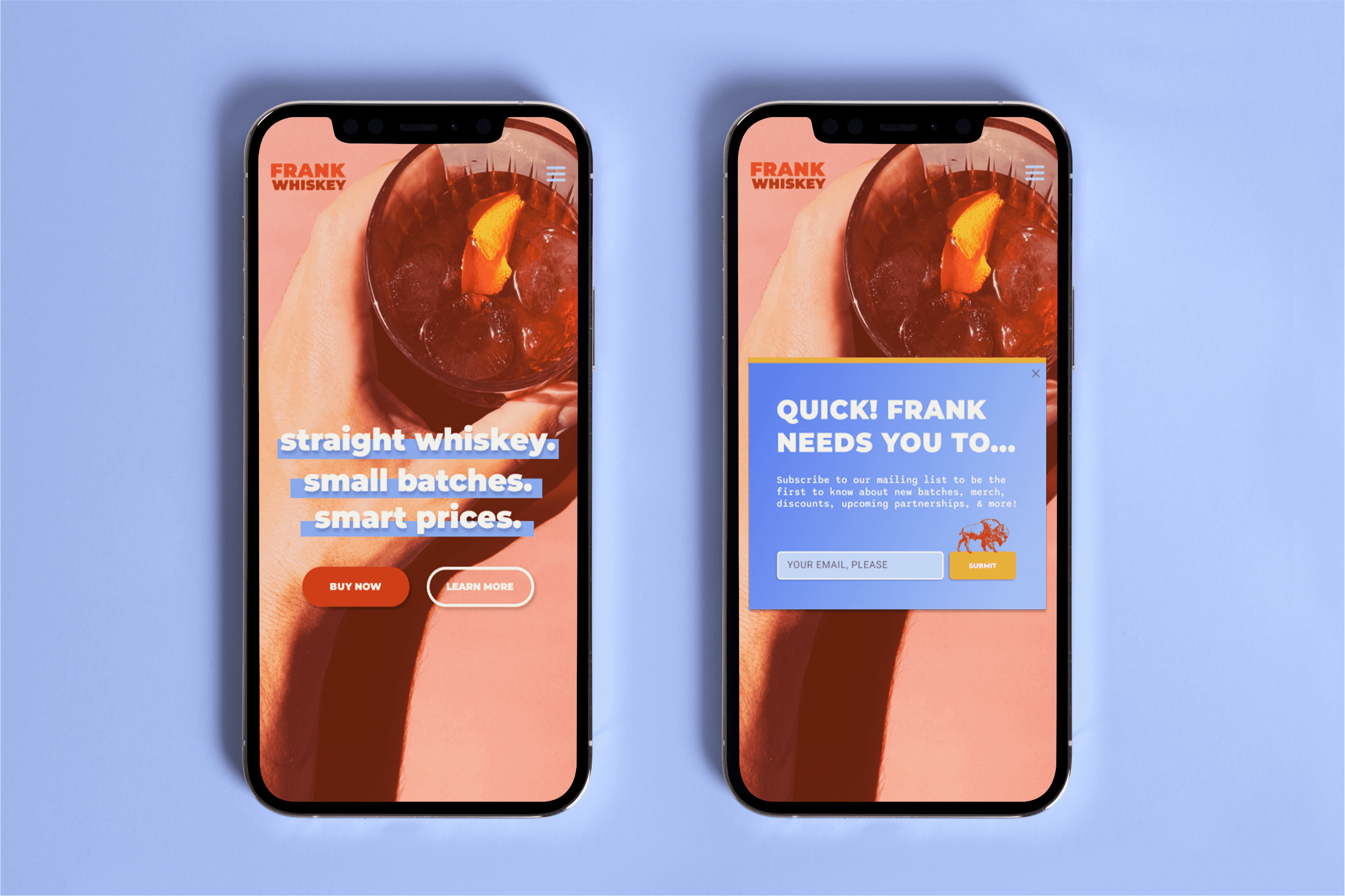
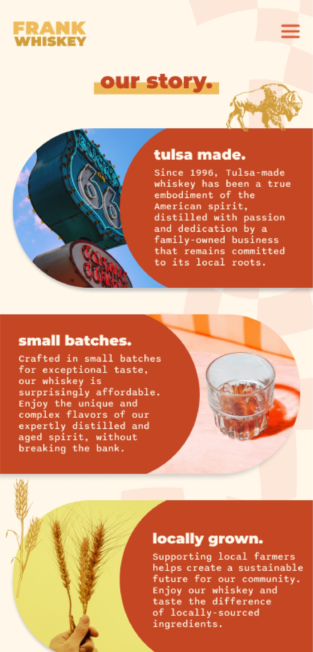
Frank Whiskey embodies three core values: accessibility, a laid-back approach, and authenticity, precisely the message the brand and website aimed to convey. I ensured accessibility through a user-friendly, informative website. The laid-back authenticity shone when we discovered the tagline: 'Straight whiskey. Small batches. Smart prices.' Alongside vibrant primary colors, this encapsulated the brand's essence. The ultimate goal was to align these values, compelling consumers to buy or discover this whiskey locally. Frankly, this goal has been achieved.


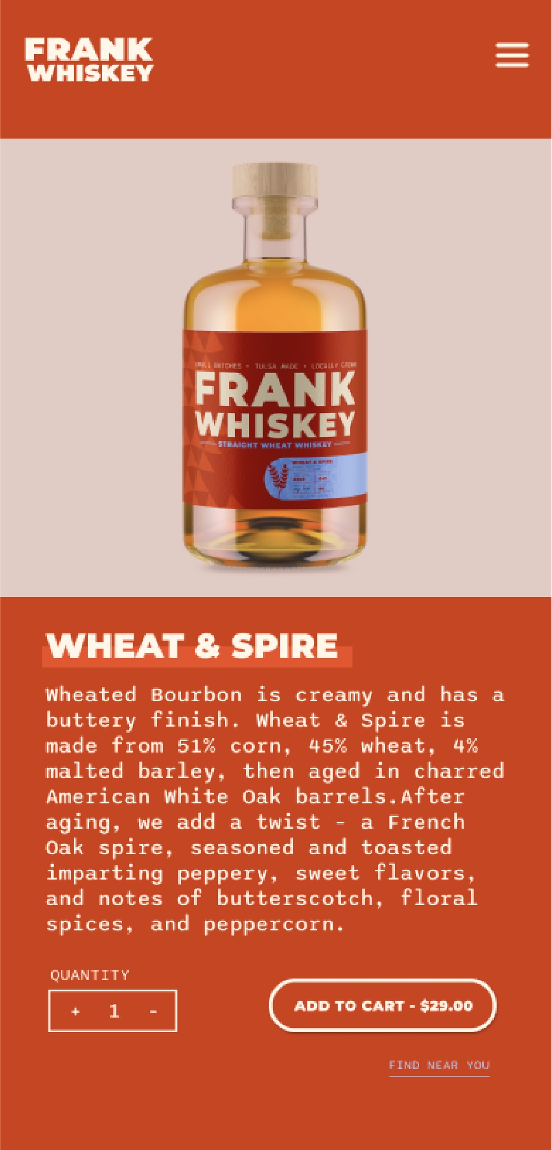
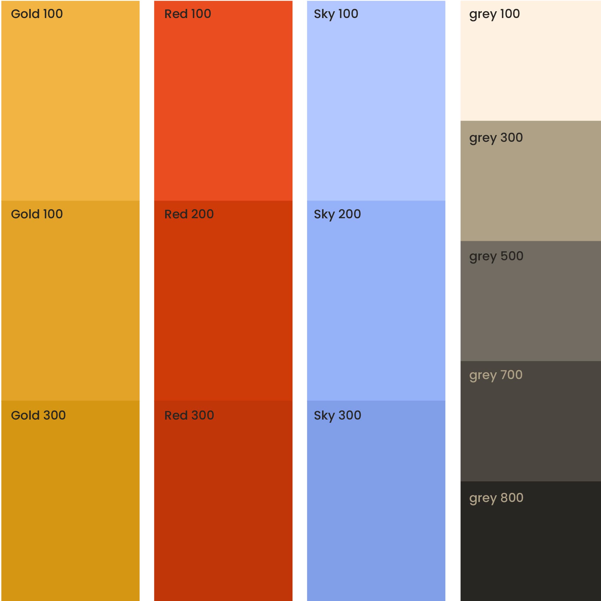
This whiskey is designed to be affordable and tailored to a millennial audience, so I aimed to break away from the ’typical’ conventions often associated with whiskey branding. Traditional whiskey branding usually leans on dark and classic colors and employs serif typefaces. In contrast, opting for a bold typeface like Montserrat Black in the logo was a deliberate choice to align the whiskey’s brand with the preferences of the target consumers. The paragraph type, Sono Medium, pays homage to 90s fonts, evoking nostalgia for millennial consumers.

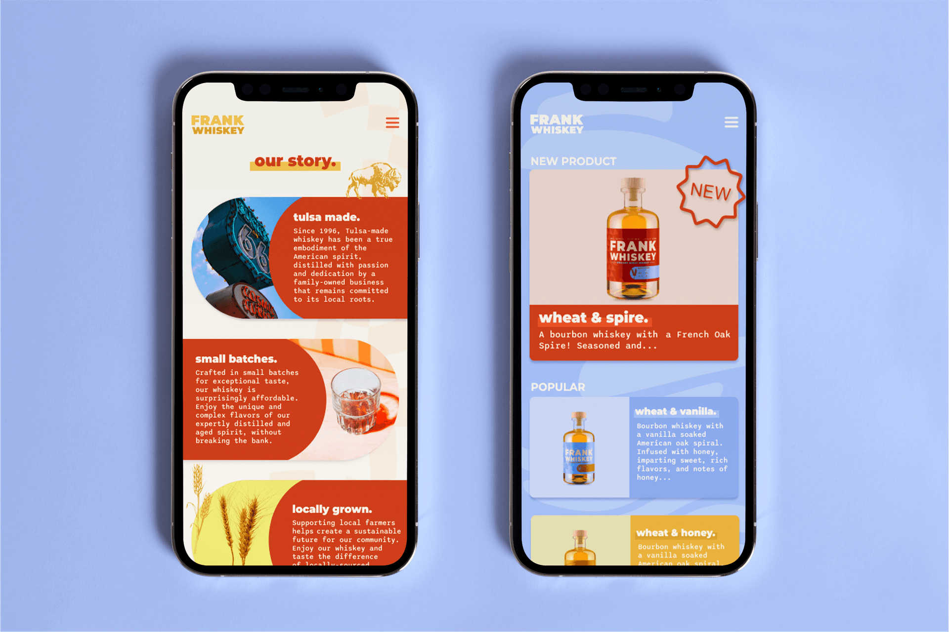
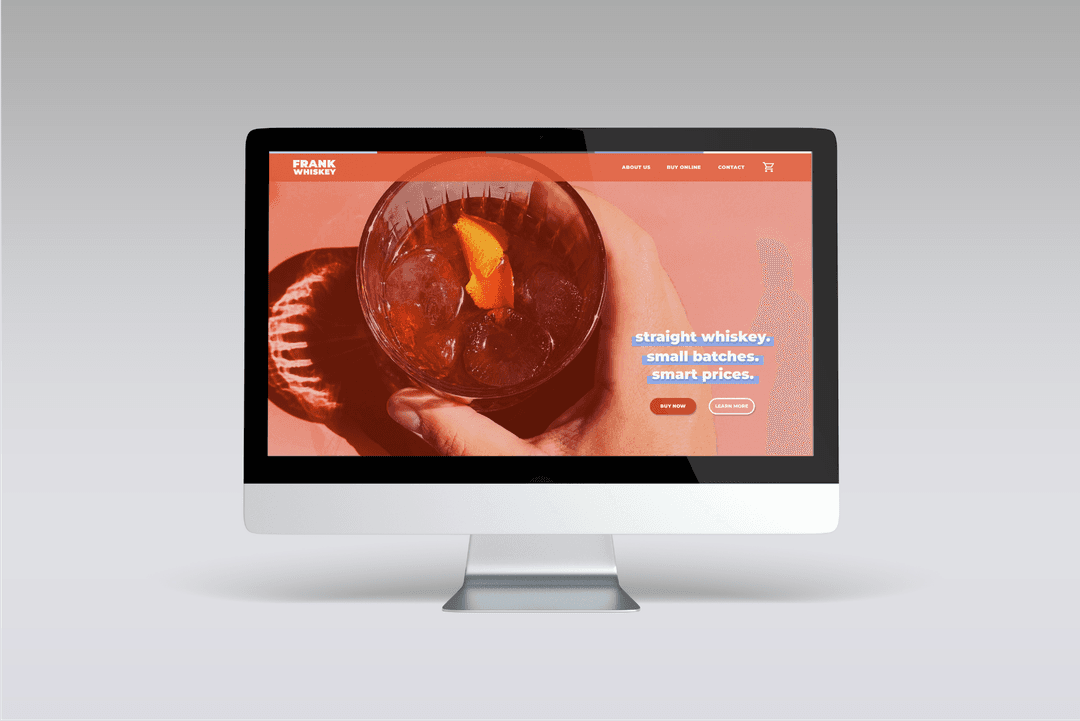
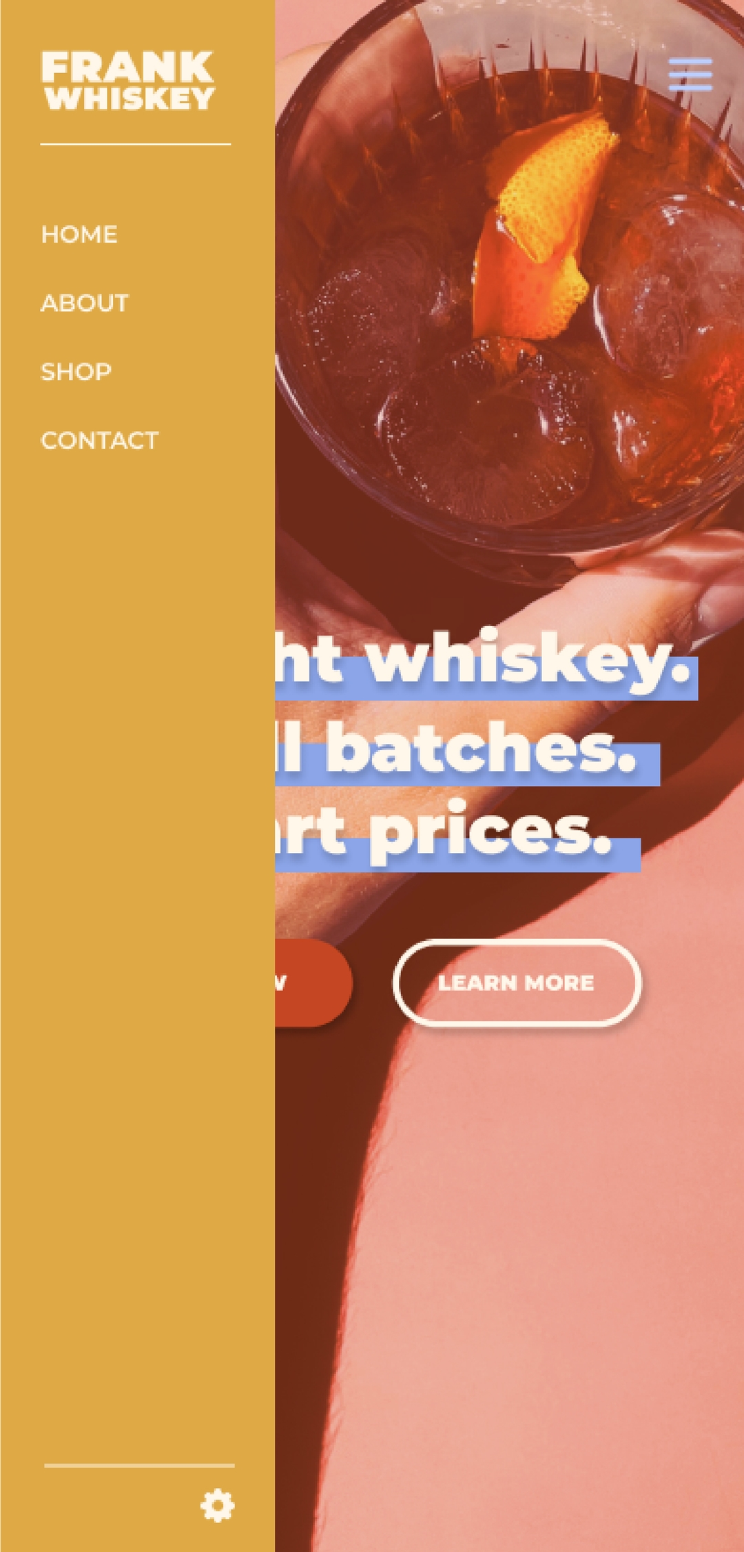
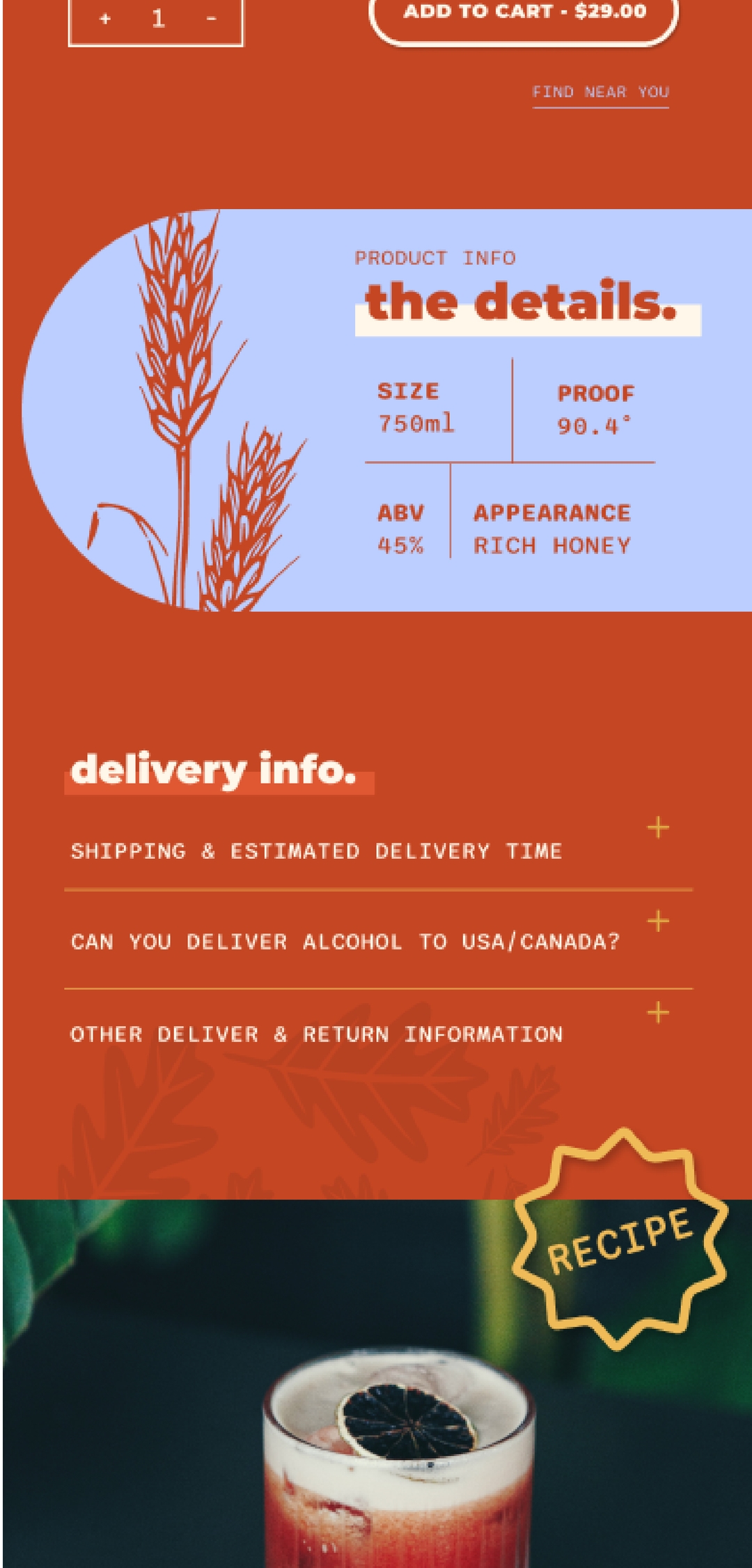
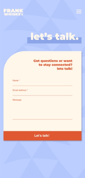
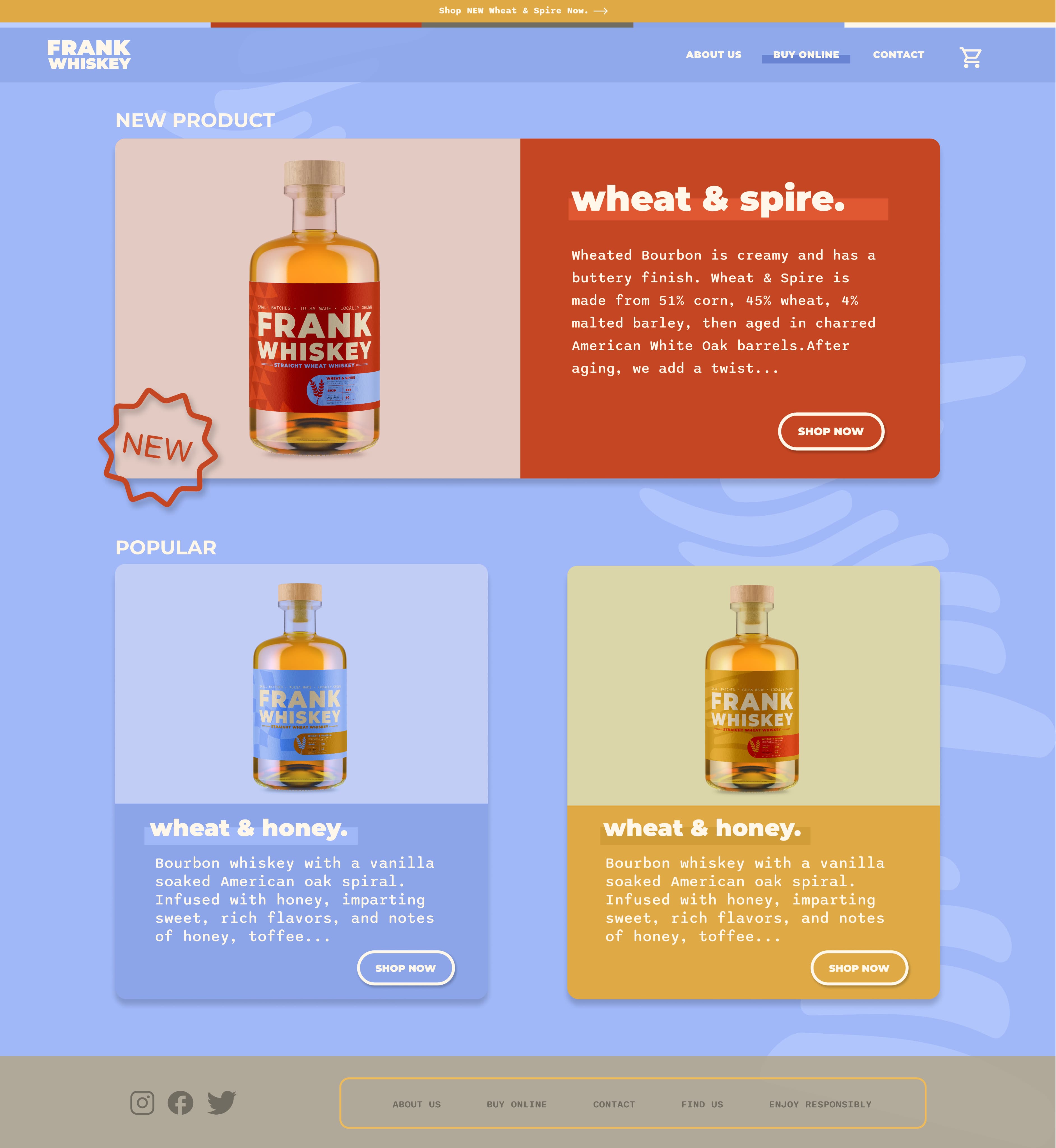
As a Figma-driven project, the website for both mobile and desktop platforms took the spotlight. The goal was clear: simplicity without unnecessary complexity, while maintaining brand consistency across key sections like the splash page, about page, product listings, and individual product pages.
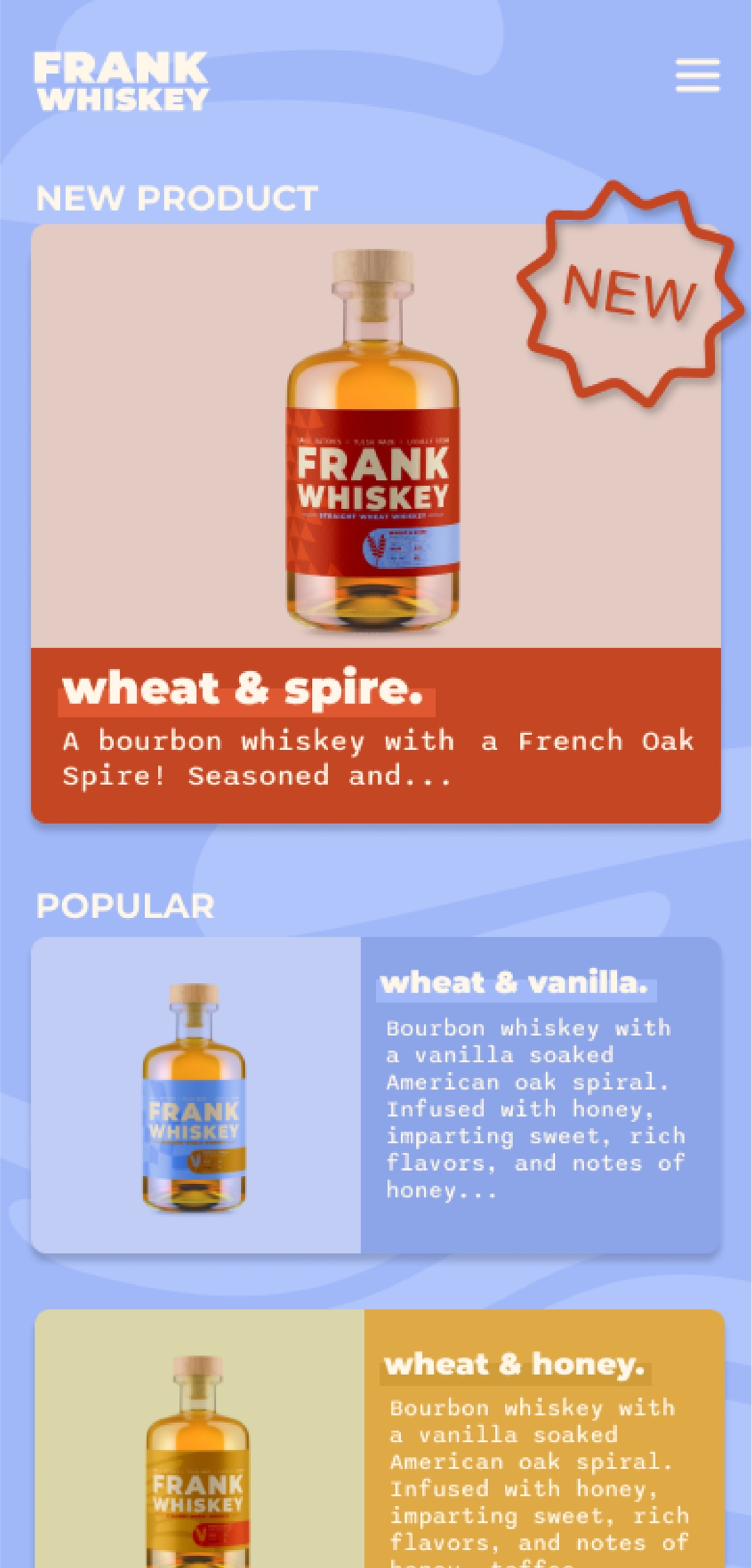
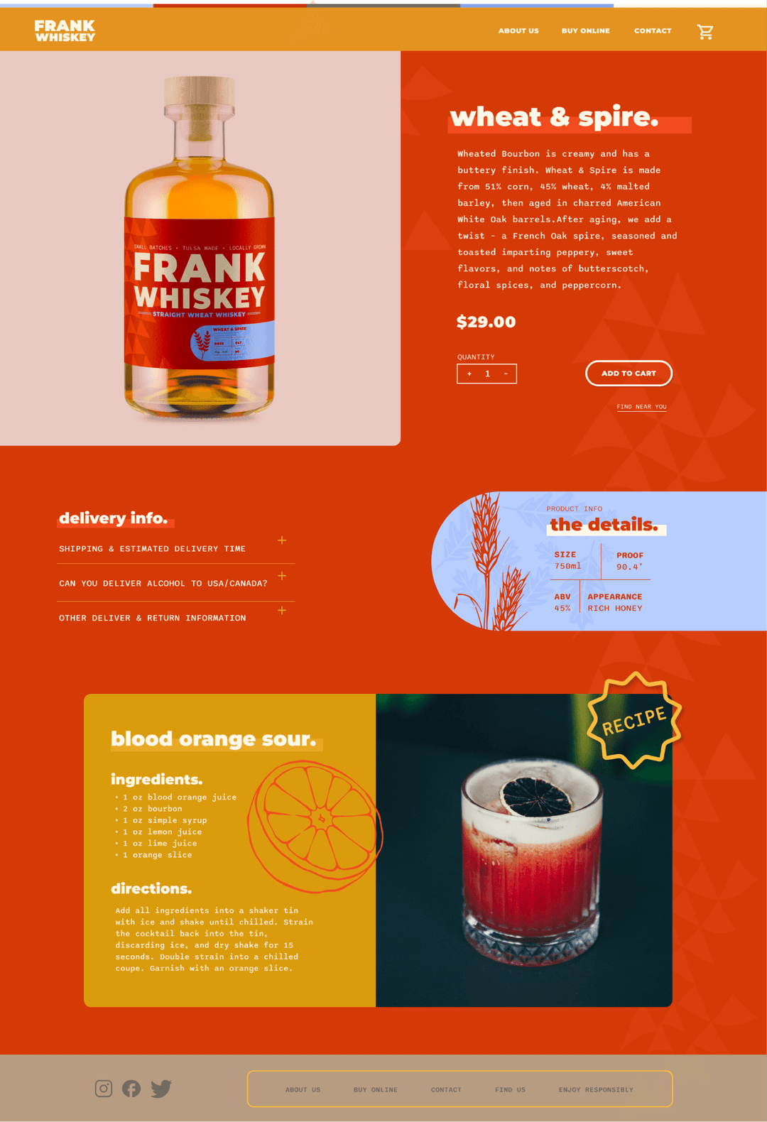
Color-coding labels served as a visual anchor, providing distinct identities for the three whiskeys and enhancing the user-friendliness of the shopping experience. Deconstructing elements from the labels and subtly integrating small label-inspired illustrations and patterns throughout the website maintained brand cohesion.
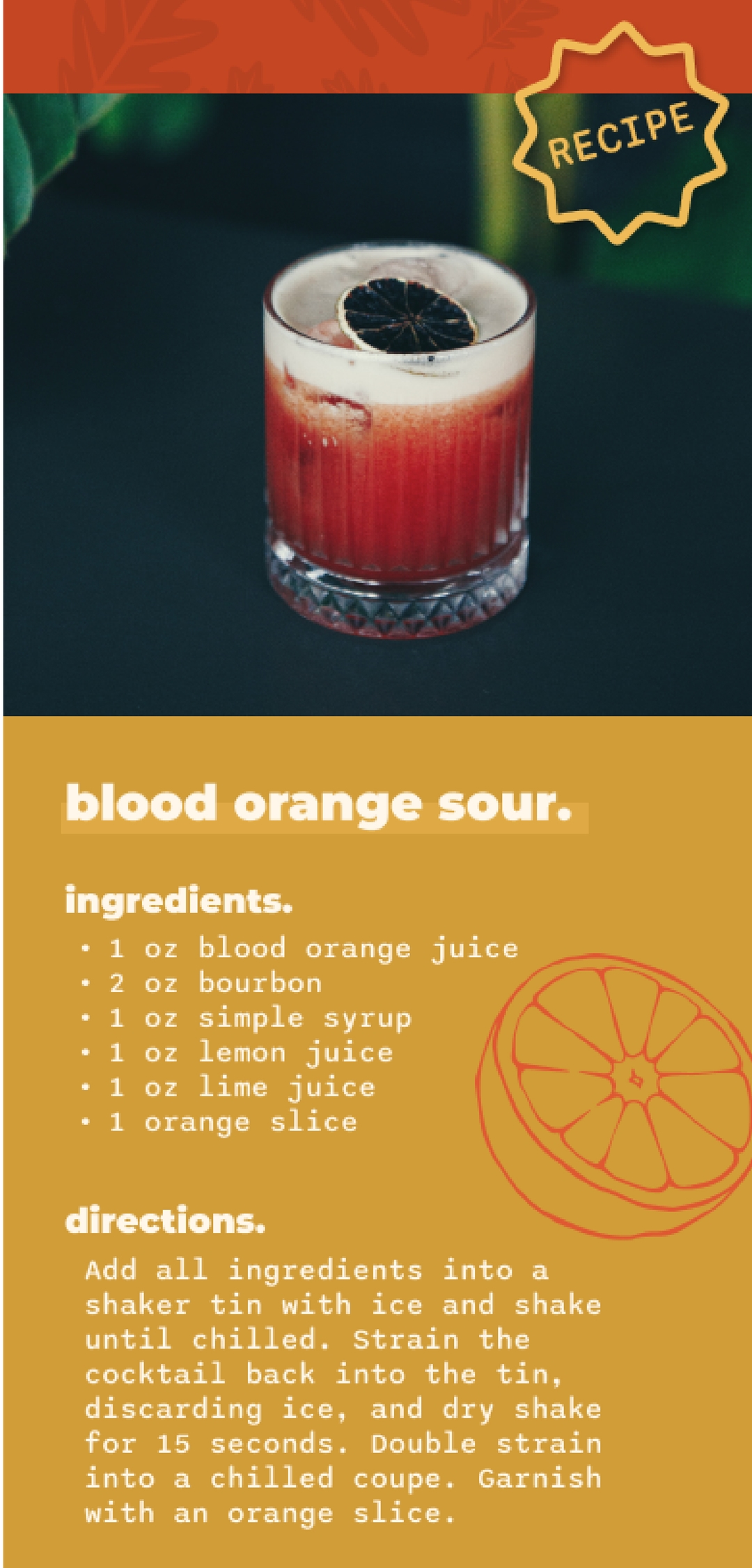
The website also featured cocktail recipes perfectly paired with each whiskey, enhancing user engagement and interaction.

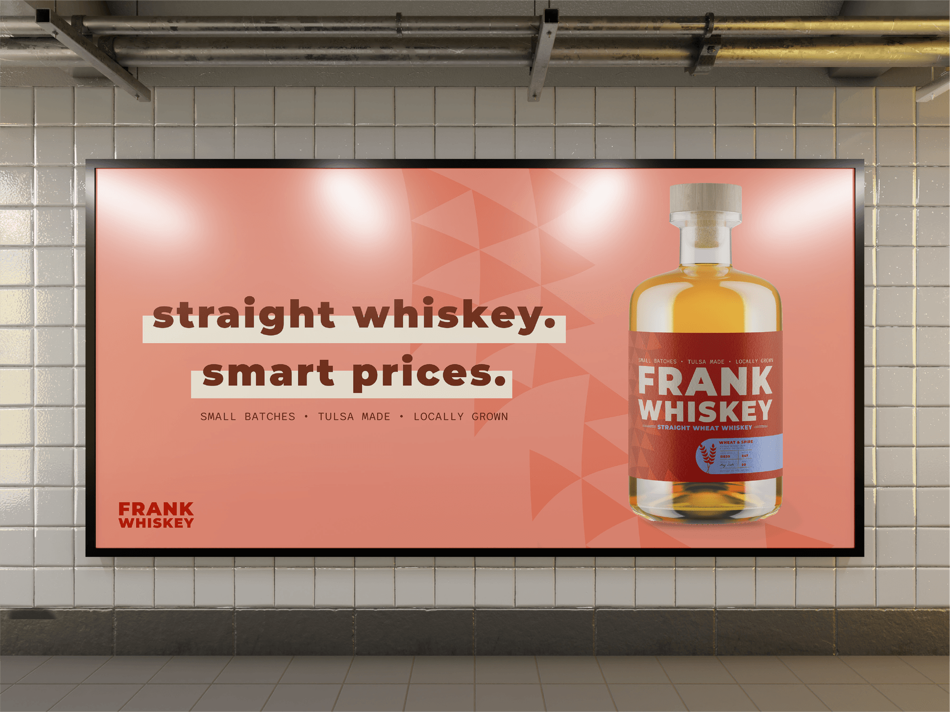
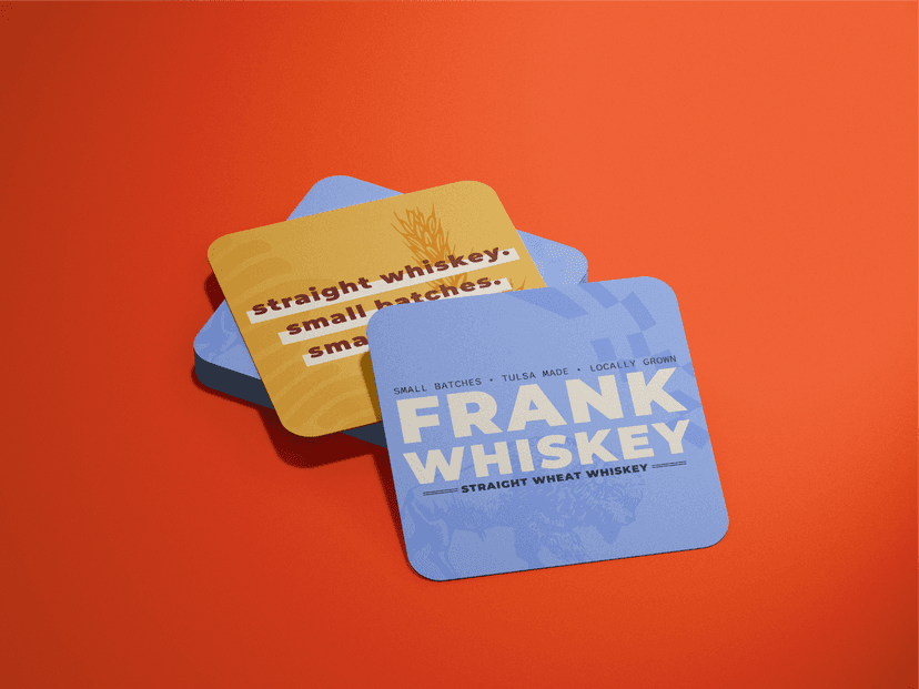
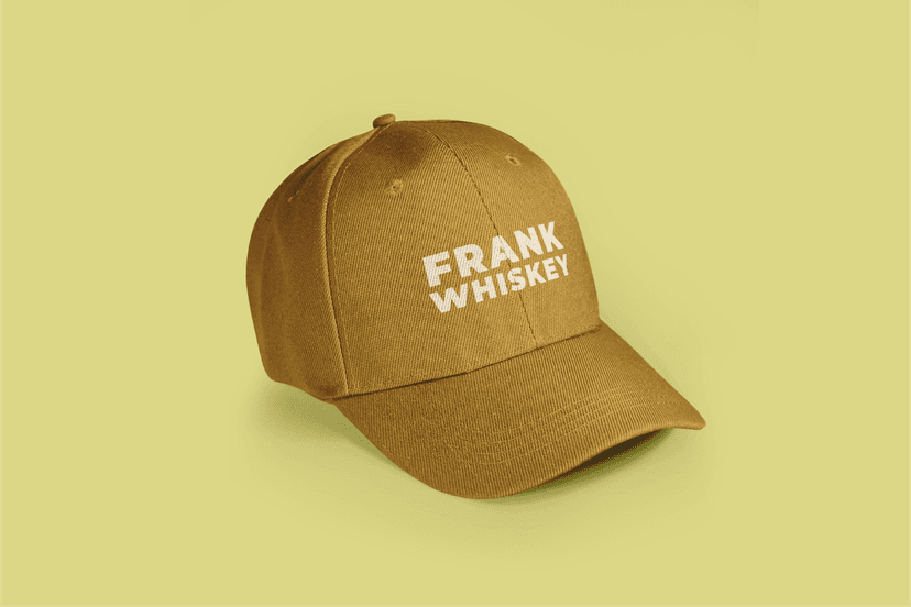
In establishing this brand from the ground up, it was clear to me that I wanted to create not only the packaging for the whiskey bottles but also develop advertising materials and branded items. This encompassed a range of products, including coasters for those enjoying whiskey cocktails.